Workforce Analytics: Benefits, Examples & Best Practices
Key Takeaways
- Workforce analytics turns HR data into decisions: it is the practice of collecting, connecting, and analyzing data across payroll, attendance, leave, and performance to guide hiring, retention, and workforce planning.
- The payoff is measurable: 71% of HR executives who use people analytics call it essential to their HR strategy, and the single biggest use case is spotting turnover risk before it costs you.
- It comes in four main types: descriptive, diagnostic, predictive, and prescriptive analytics answer what happened, why it happened, what is likely next, and what to do about it.
- Clean, connected data decides everything: analytics only works when your workforce data lives in one place, which is where an all-in-one Human Resource Management System (HRMS) like brioHR removes the export-and-reconcile busywork.
Most HR teams already sit on valuable workforce data. The problem is that it lives in scattered places: headcount in one tool, payroll in another, attendance in a third. By the time your boss asks about turnover cost or labor spend, you are rebuilding the answer from scratch.
Workforce analytics fixes that. It is the practice of turning employee data into clear insights that guide hiring, retention, and planning. And it is now standard practice: 71% of HR executives who use people analytics say it is essential to their HR strategy, according to the Society for Human Resource Management (SHRM).
This guide covers what workforce analytics is, its benefits, the four types, the metrics to track, real examples, common challenges, and the best practices to get it right.
What Is Workforce Analytics?
Workforce analytics is the collection, integration, and analysis of workforce data to make better HR decisions. It goes beyond basic reporting by looking for patterns, forecasting outcomes, and pointing to the actions that improve results.
In plain terms, it answers three questions leaders actually care about: who is on your team, how they are performing, and what is likely to happen next. Sometimes called workforce analysis or employee analytics, it is closely related to people analytics and HR analytics, though it takes the broader view across the whole organization rather than a single team.
A quick example: instead of noting that turnover rose last quarter, workforce analytics helps you see that it rose in one department, among staff with less than one year of tenure, right after a change in shift patterns. That is the difference between a number and a decision.
What Are the Elements of Workforce Analytics?
Every workforce analytics program rests on three building blocks. Get these right and the insights follow. Miss one and the whole thing stalls.
- Connected workforce data: the raw material, pulled from payroll, attendance, leave, and performance.
- Analytics technology: the dashboards and reports that turn that data into a clear picture.
- Analytical capability: the people and process that read the numbers and act on them.
Element 1: Connected Workforce Data
Data is the foundation, and its quality sets the ceiling for everything else. Workforce analytics draws on many sources: employee records, payroll, leave balances, attendance and overtime, performance reviews, and engagement surveys.
The catch is that this data usually lives in separate systems that do not talk to each other. When your payroll figures sit in one place and your attendance data in another, every report becomes a manual reconciliation job, and every reconciliation is a chance for the numbers to drift.
This is why a connected source of truth matters so much. When leave, time and attendance, payroll, and performance all update in the same system, your analytics reflect the latest approved data by default, with no exporting required.
Element 2: Analytics Technology and Dashboards
Raw data on its own changes nothing. You need technology to organize it, visualize it, and surface the trends worth acting on.
This is where dashboards, headcount views, attrition tracking, and custom report builders come in. They translate thousands of rows into a picture a busy HR manager or CEO can read in seconds. A good HR reporting software layer lets you filter by department, role, entity, or date, then save that view as a reusable template.
The best tools connect this reporting directly to your operational data, so a headcount view already reflects approved salaries and current leave balances. To compare options, see our roundup of the best workforce analytics tools.
Element 3: Analytical Capability in the HR Team
The third element is human. Analytics only pays off when someone can interpret the numbers and translate them into action.
That does not mean hiring a data scientist. For most SMEs and midmarket teams, it means an HR manager who knows which metrics matter, can spot a worrying trend, and can build a clear case for leadership. The tool does the heavy lifting, and your team does the thinking.
Strong capability also means asking the right questions first. Good workforce analytics starts with a business problem, not a dashboard. For a deeper look at how the reporting itself is structured, see our guide to top HR reporting software.
"It's not digitizing for the sake of digitizing. It's really about performance improvement for the company."
Top Benefits of Workforce Analytics
Workforce analytics helps you replace gut feeling with evidence. Here are the five benefits that matter most for growing companies.
1. Better, Evidence-Based Decisions
The core benefit is confidence. Instead of guessing at headcount, pay, or promotions, you decide from data that reflects what is actually happening across the business.
This matters because HR decisions carry real cost. A hiring freeze in the wrong department, or a raise that misses a flight risk, plays out on the payroll for years. Evidence-based decisions tighten that aim, and they also give HR a stronger seat at the leadership table.
2. Lower Turnover and Real Retention Savings
Attrition is the highest-value question workforce analytics can answer, because turnover is expensive. Gallup estimates that replacing one employee costs between one-half and two times their annual salary.
Analytics helps you catch turnover risk months earlier. By tracking resignation patterns across departments, tenure bands, and roles, you can spot the early signals and act before a valued employee is already halfway out the door. It is the most common use of the data, too: 82% of organizations that use people analytics apply it to retention and turnover, according to SHRM. Catching even one flight risk a quarter often pays for the whole system.
3. Smarter, Faster Hiring
Workforce analytics shows you which recruitment channels bring the best candidates, how long each stage takes, and where good applicants drop off.
That visibility cuts both cost and time. SHRM benchmarking puts the average cost per hire at around $5,475 for non-executive roles, so trimming wasted spend on low-yield channels adds up quickly. Better hiring data also feeds directly into a smoother onboarding experience for the people you do bring on.
4. Accurate Workforce Planning and Labor Cost Control
Labor is often the single largest line in the budget. Workforce analytics gives you the headcount, cost, and overtime data to plan the next hiring cycle with precision rather than hope.
It also flags cost creep early. Rising overtime in one team, or a growing gap between planned and actual headcount, shows up on a dashboard long before it shows up in a painful year-end review. For teams weighing outside help, our payroll outsourcing guide covers when that makes sense.
5. Higher Engagement and Productivity
Engaged people stay longer and perform better. Analytics helps you measure engagement, connect it to outcomes, and see which teams need attention.
The strongest signal comes from reading two data sets side by side. Turnover data tells you who left, and employee pulse surveys tell you why. Together they surface retention risk while you can still do something about it.
Types of Workforce Analytics
Workforce analytics comes in four main types, each answering a different question. Most teams start with the first and grow toward the fourth as their data matures.
Type 1: Descriptive Analytics
What happened? Descriptive analytics reports on the current and past state of your workforce. Think headcount by department, last quarter's turnover rate, or average tenure.
It is the starting point and the foundation for everything else. Before you can predict or prescribe, you need a clear, accurate baseline of who your people are and how they are doing.
Type 2: Diagnostic Analytics
Why did it happen? Diagnostic analytics digs into the causes behind a trend. If turnover spiked, this is where you find out whether it was tied to a specific manager, pay band, department, or shift pattern.
It moves you from noticing a problem to understanding it. That understanding is what makes the next action worth taking rather than a guess.
Type 3: Predictive Analytics
What is likely to happen next? Predictive analytics uses historical patterns to forecast future outcomes, such as which employees are most likely to resign or where you will face a skills gap.
This is where analytics starts to feel proactive. Instead of reacting to a resignation letter, you see the risk building and step in early. Predictive capability, usually powered by artificial intelligence (AI), tends to sit in more advanced, enterprise-grade platforms.
Type 4: Prescriptive Analytics
What should we do about it? Prescriptive analytics recommends the best course of action based on the prediction, for example a targeted retention plan for a high-risk team.
It is the most advanced type and the one that turns insight into a clear next step. A quick fifth mention worth noting is real-time analytics, which monitors developments as they happen, such as a sudden spike in absenteeism, so you can respond the same day.
How Workforce Analytics Works in HR Teams
In practice, workforce analytics follows a repeatable five-step workflow. Modern HR platforms like brioHR support each stage, from collecting the data to acting on it.
Step 1: Collect Workforce Data
Everything starts with gathering data from across the employee lifecycle. That means pulling from HR records, payroll, time and attendance, performance reviews, and engagement tools.
The goal at this stage is coverage. The more of the picture you capture, the more questions your analytics can answer later. A departure record is far more useful when it sits next to that person's pay history, leave usage, and last performance rating.
This is also where an all-in-one system earns its keep. When collection happens automatically as HR does its normal work, you avoid the slow, error-prone job of exporting and merging files from five different tools every month.
Step 2: Organize and Clean the Data
Raw data is messy. Names are spelled two ways, departments are labeled inconsistently, and the same field means different things in different systems. Before analysis, you have to standardize it.
Clean data is not a nice-to-have. It is the difference between a report leadership trusts and one they quietly ignore. Consistent definitions matter most here: everyone needs to agree on what counts as a resignation, a department, or a full-time role.
A connected platform reduces this burden dramatically. When data enters one system with shared definitions, much of the cleaning is already done. Features like expense management systems that feed approved claims straight into reporting keep the numbers consistent from input to output.
Step 3: Build Dashboards and Reporting Layers
Next, you turn clean data into a picture. Dashboards and reports give HR leaders a live view of team size, composition, attrition, and workforce health.
This is the stage that makes analytics usable day to day. A well-built headcount dashboard answers a leadership question on screen, rather than sending you back to a spreadsheet you rebuild every quarter.
Good reporting is also flexible. You should be able to filter by department, role, or entity, then save that view for finance, managers, or audits. For a broader tour of what this layer looks like, see the best employee engagement software and how engagement data feeds the same dashboards.
Step 4: Analyze Patterns and Identify Insights
With dashboards in place, you look for what the data is telling you. This is where turnover risks, productivity trends, hiring gaps, and performance signals come into focus.
The skill here is separating signal from noise. A one-month blip is rarely a trend, but a steady climb in overtime across a single team, or rising attrition among new hires, is worth a closer look.
The best insights connect two data sets that usually live apart. Pairing attendance with payroll reveals labor cost drift. Pairing performance with tenure reveals who your flight risks really are. A connected leave management software view sitting next to payroll makes these connections obvious.
Step 5: Take Action and Monitor Continuously
Insight is worthless until it drives a decision. The final step turns analysis into hiring choices, retention plans, and workforce strategy, then tracks whether those actions worked.
This closes the loop. You spot a retention risk, you act on it, and then you watch the numbers to see if the fix held. Over time, this cycle makes your team sharper and your decisions faster.
Continuous monitoring is what separates a one-off report from a genuine analytics practice. The systems that support this well handle the routine work, including document management and record keeping, so your team spends its time on the decisions, not the admin.
See how brioHR turns your HR data into live workforce analytics, no spreadsheets required. Book a Free Demo →
Key Workforce Analytics Metrics to Track
You do not need to track everything. Start with the handful of metrics that map to your biggest decisions: retention, hiring, cost, and productivity. Here are the core ones and why they matter.
| Metric | What It Tells You | Why It Matters |
|---|---|---|
| Turnover (attrition) rate | The share of employees who leave over a period | The clearest early warning of retention and culture problems |
| Time to hire | How long it takes to fill an open role | Long cycles cost productivity and lose good candidates |
| Cost per hire | Total recruiting spend per new employee | Flags where your hiring budget is being wasted |
| Absenteeism rate | Unplanned absence across teams | A leading signal of burnout and disengagement |
| Headcount and composition | Team size by department, role, or entity | The base for all workforce planning and budgeting |
| Labor cost ratio | Payroll cost as a share of revenue or budget | Keeps your largest expense line under control |
| Overtime hours | Extra hours worked by team | Rising overtime points to understaffing or cost creep |
| Average tenure | How long employees typically stay | A steady view of workforce stability over time |
Common Workforce Analytics Examples and Case Studies
The clearest way to understand workforce analytics is to see it in action. The scenarios below are representative examples of how growing companies in the region use it to solve real problems.
Example 1: A Manufacturer Tackles Frontline Turnover
Scenario: A mid-sized manufacturer in Malaysia was losing frontline staff faster than it could hire them, with no clear reason why.
Challenge: Attendance sat in one system and payroll in another, so leadership could not see that turnover was concentrated among new hires on a specific shift pattern.
Solution: By moving to a connected HRMS, the team could read attrition, tenure, and shift data in one view. The pattern was obvious within a week: resignations clustered among staff in their first 90 days on rotating shifts.
Outcome: A targeted onboarding and scheduling change for that group reduced early attrition and cut the constant rehiring cost that had been quietly draining the budget.
Example 2: A Services Firm Controls Labor Cost
Scenario: A Singapore services company suspected it was overspending on overtime but could not prove where.
Challenge: Overtime data lived in timesheets that no one connected to payroll, so the true cost stayed hidden until each month closed.
Solution: With attendance and payroll in the same reporting layer, the finance and HR teams built a single overtime dashboard filtered by department.
Outcome: Two teams accounted for most of the spend. A staffing adjustment brought overtime back in line and gave leadership a live view of labor cost going forward.
Example 3: A Retail Chain Plans Headcount With Confidence
Scenario: A growing retail chain planned each hiring round on instinct and kept getting caught short during peak seasons.
Challenge: Headcount, tenure, and seasonal turnover data were scattered across store spreadsheets, making forecasting a guess.
Solution: Centralized headcount dashboards and attrition trends gave the team a clear, entity-level view of who they had and when they typically lost them.
Outcome: Hiring plans lined up with actual demand, and store managers stopped scrambling to cover peak periods.
Want this kind of visibility for your own team? See brioHR's reporting and analytics in action. Book a Free Demo →
Turn your HR data into live workforce analytics
Headcount, attrition, and labor cost views ready when leadership asks. No spreadsheets, no manual exports.

Challenges of Workforce Analytics
Workforce analytics is worth the effort, but it is not automatic. Most teams hit the same handful of obstacles. Here is what causes each one and how to get past it.
| Challenge | Why It Happens | How to Overcome It |
|---|---|---|
| Data silos | HR data lives in separate tools that do not connect | Move to a single connected HRMS so data shares one source of truth |
| Poor data quality | Inconsistent labels and definitions across systems | Agree on shared definitions and let one system enforce them |
| HR skills gap | Teams lack time or training to interpret data | Choose tools with prebuilt dashboards, not raw exports |
| Cultural resistance | Leaders are used to deciding on instinct | Start with one clear win that proves the value in dollars |
| Privacy and compliance | Employee data is sensitive and regulated | Use role-based access and a platform with strong security |
Notice that the first two challenges, which are the most common, both come down to disconnected data. Solve that, and the rest get far easier. Feedback tools help too: pairing analytics with 360 feedback tools adds context that raw numbers miss.
See How brioHR Supports Workforce Analytics and HR Reporting

brioHR is an all-in-one HRMS built for companies in Malaysia and Singapore that want workforce analytics without stitching together five separate tools. More than 1,000 organizations across 50 countries use it.
Its analytics advantage is simple: nothing is bolted on. Headcount, attrition, labor cost, and performance signals all draw from the same live data across payroll, leave, attendance, and performance, so HR and leadership always see one consistent set of numbers.
What Is brioHR Best For?
brioHR is best for growing SMEs and midmarket teams, roughly 50 to 1,000 employees, that are moving from spreadsheets and disconnected tools to connected, data-driven HR. It is especially strong for companies that need local compliance in Malaysia and Singapore alongside real workforce reporting, all in one place.
brioHR Key Features
Three capabilities stand out for teams focused on workforce analytics.
Custom Report Builder and Saved Report Templates
The Report Builder under the Analytics menu lets HR teams build reports across any combination of employee, payroll, leave, attendance, and performance data. Use Fields & Filters to include exactly the data you need, then Save As a reusable template for finance, managers, or audits. Reports export to CSV, Excel, or PDF in a couple of clicks.
Headcount Dashboards and Attrition Statistics
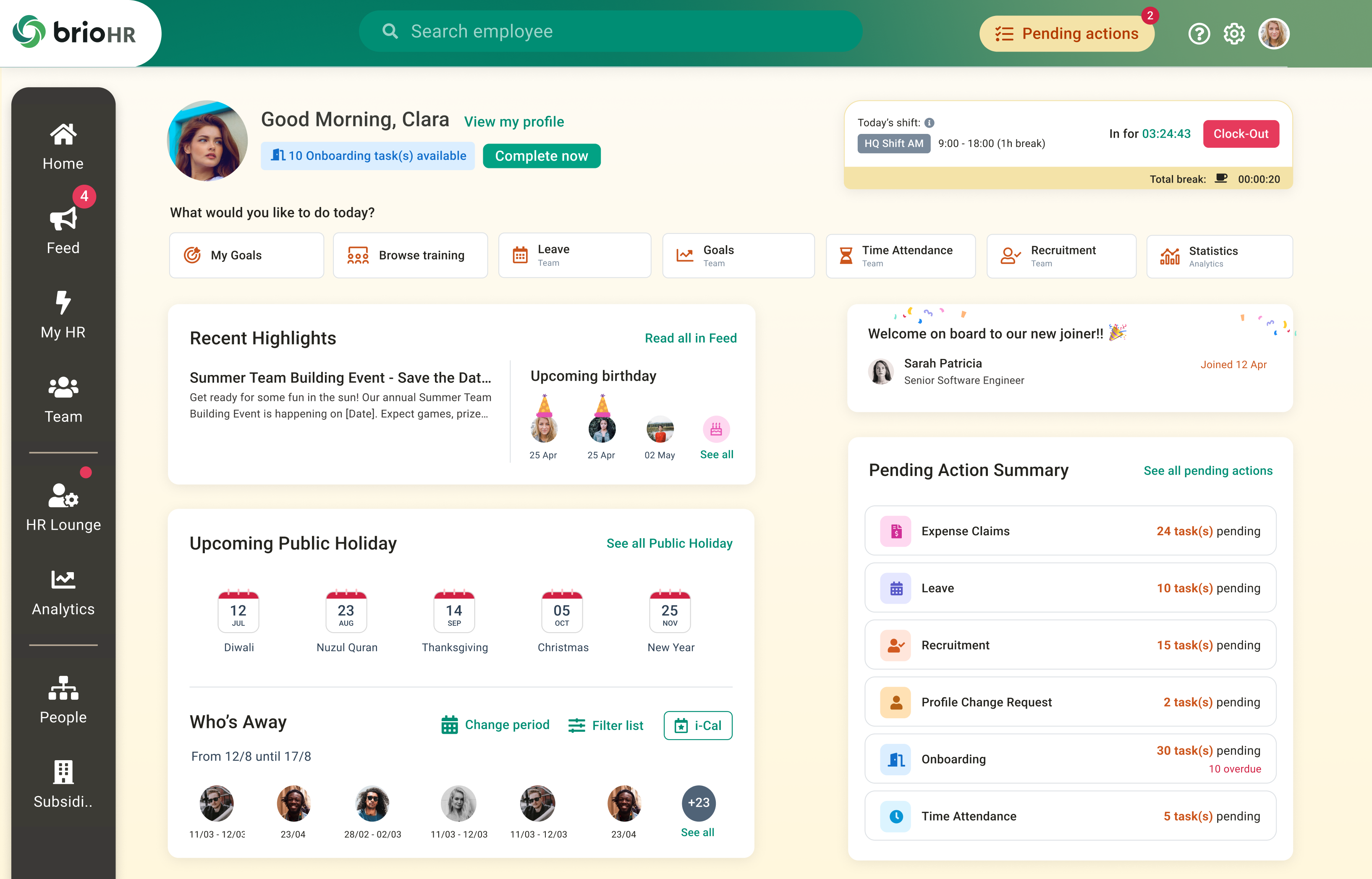
The Statistics page gives real-time visibility into your workforce, with an Attrition view that calculates your monthly turnover rate automatically. General statistics cover total active employees, average workforce age, average years of service, and breakdowns by gender, nationality, department, job grade, and tenure. You can filter every view by department, office, job grade, and employment type.
Analytics Connected to Live Payroll and HR Data
Because performance management, goals, attendance, leave, and payroll all run on one platform, your labor-cost and productivity views always reflect the latest approved data. For teams with staff in both markets, brioHR handles EPF, SOCSO, and LHDN alongside CPF, SDL, and IR8A in the same reporting layer. You can also export data or connect via secure Application Programming Interface (API) to tools like Power BI and Looker Studio.
brioHR Pricing
brioHR uses modular, per-employee pricing, so you pay for the modules you actually use.
| Plan | Details |
|---|---|
| Modular pricing | From RM3 per employee per month (Malaysia) or S$2 per employee per month (Singapore), based on the modules selected |
| Custom quote | Tailored to your headcount, workflows, and rollout needs |
For a wider comparison of options, see our guides to the best HR analytics software and the best employee time tracking software.
Where brioHR Shines, and Where It Does Not
What brioHR does well:
- Analytics on live operational data: headcount, attrition, and custom reports draw from the same payroll, leave, and attendance records, so the numbers HR presents match what payroll will run.
- Local compliance built in: EPF, SOCSO, EIS, LHDN, CPF, SDL, and IR8A workflows run natively, with statutory reports in the same layer as the rest of your workforce data.
- Fast to adopt: a clean interface means managers and employees actually use the system, which is where many analytics platforms quietly fail.
Where it has limits:
- No predictive AI: brioHR delivers connected, live reporting rather than AI-driven attrition forecasting or scenario-based modeling.
- Built for real HR complexity: very small teams under 30 people may not generate enough data to justify the full platform.
What Reviewers Say
Third-party validation matters more than any marketing claim, so it is worth checking the review platforms. brioHR holds 4.7 out of 5 on G2 from 31 verified reviews and 4.9 out of 5 on Capterra from 57 verified reviews. Reviewers consistently highlight the user-friendly interface, easy implementation, and how it brings payroll, leave, and employee data into one place. You can read more in brioHR's client success stories.


In fairness, dedicated enterprise workforce analysis tools like Workday and Visier lead on predictive, AI-driven forecasting at global scale. For most SMEs and midmarket teams in Malaysia and Singapore, though, brioHR delivers the analytics that matter without enterprise cost or a year-long rollout.
Turn your payroll, leave, and attendance data into live workforce analytics with brioHR. Book a Free Demo →
Best Practices to Successfully Implement Workforce Analytics
A tool alone will not deliver results. These five practices are what separate teams that get value from workforce analytics from those that buy a dashboard and never use it.
1. Start With Business Goals, Not Data
Analytics works only when it is tied to a business question. Before you open a dashboard, get clear on what leadership actually needs: lower turnover, faster hiring, or tighter labor cost.
Starting with the goal keeps you from drowning in metrics that look interesting but change nothing. It also makes it far easier to prove value later, because you set out to answer a specific, measurable question.
2. Define Clear, Time-Bound KPIs
Turn each goal into a specific key performance indicator (KPI). Not just reduce turnover, but reduce first-year attrition to under 10% by the fourth quarter.
Specific, time-bound targets give your analytics something to measure against. They also make it obvious whether an action worked, which is the whole point of tracking in the first place.
3. Centralize and Clean Your Data First
Analytics is only as good as the data underneath it. Before you chase advanced insights, get your workforce data into one place with consistent definitions.
This is the single highest-leverage step for most teams. A connected HRMS that captures payroll, leave, attendance, and performance in one system removes most of the cleaning work and keeps your numbers trustworthy. Our guide on how to automate payroll is a good place to start.
4. Invest in the Right Technology
Choose a platform that fits your team's actual capability. For most SMEs, that means prebuilt dashboards and an easy report builder, not a heavy enterprise system that needs a dedicated analyst.
Match the tool to the job. If your teams work in shifts, prioritize connected scheduling data, and see our roundup of the best shift management software for what to look for.
5. Turn Insights Into Action, Then Iterate
The final practice is a habit, not a step. Every insight should lead to a decision, and every decision should be measured so you can learn from it.
This is where analytics compounds. Each cycle of spot, act, and review makes the next one sharper. Teams that build this loop turn HR from a reactive admin function into a genuine driver of business results.
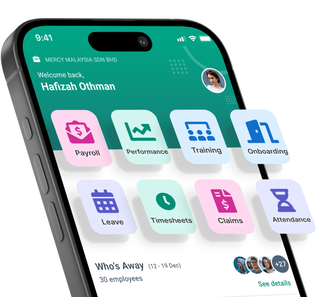
Everything HR.
One login
From payroll to onboarding, brioHR gives you everything you need in one place. Built for busy teams. Backed by people who care.
Turn Workforce Data Into Better Business Decisions With brioHR
Most HR teams spend too much time compiling workforce data and not enough using it. Workforce analytics flips that, giving you live headcount, attrition, and labor-cost views ready when leadership asks.
The fastest path there is connected data. For growing companies in Malaysia and Singapore, brioHR brings payroll compliance, performance, and workforce analytics into one platform. Explore brioHR, or book a demo to see it with your own data.
Ready to make smarter workforce decisions? See brioHR's built-in analytics in action. Book a Free Demo →
Conclusion
- Workforce analytics turns scattered HR data into clear decisions on hiring, retention, and planning — the fastest path there is connected data in one system.
- The five-step workflow (collect, clean, build dashboards, analyze, act) works for any team size, and gets sharper with every cycle.
- brioHR delivers live headcount, attrition, and labor-cost analytics from the same data as payroll and compliance — no exports, no stitching.
- Start small: pick three metrics tied to real decisions, prove the value, and expand from there.